1
/
of
10
Kutani Matcha Bowl with Geometric Triangle Pattern by Tohou — Gold-Leaf Kinrande Rinko-Mon Chawan, Tomobako
Kutani Matcha Bowl with Geometric Triangle Pattern by Tohou — Gold-Leaf Kinrande Rinko-Mon Chawan, Tomobako
Regular price
Dhs. 488.00 AED
Regular price
Sale price
Dhs. 488.00 AED
Taxes included.
Shipping calculated at checkout.
Experience Authentic Japan Art with this Kutani Matcha Bowl by Tohou. This Kinrande Chawan serves as a Japanese Tea Bowl and Geometric Pottery, featuring Rinko-mon Triangle Pattern and Gold-Leaf Overglaze Enamel—a must-have for any Art Collector seeking bold Kutani Porcelain with modern visual presence.
🔹 [ BASIC DETAILS ]
• Artist: Tohou (陶峰) — Kutani potter
• Technique: Kinrande overglaze enamel with gold-leaf (金泥) ground; geometric rinko-mon (麟甲文 / scale-pattern) in deep cobalt and emerald green triangles; fine crackle (貫入) glaze
• Era: 2000 – 2006
• Origin: Kutani ware, Ishikawa Prefecture, Japan
• Dimensions: Diameter approx. 12.5 cm / Height approx. 7.5 cm
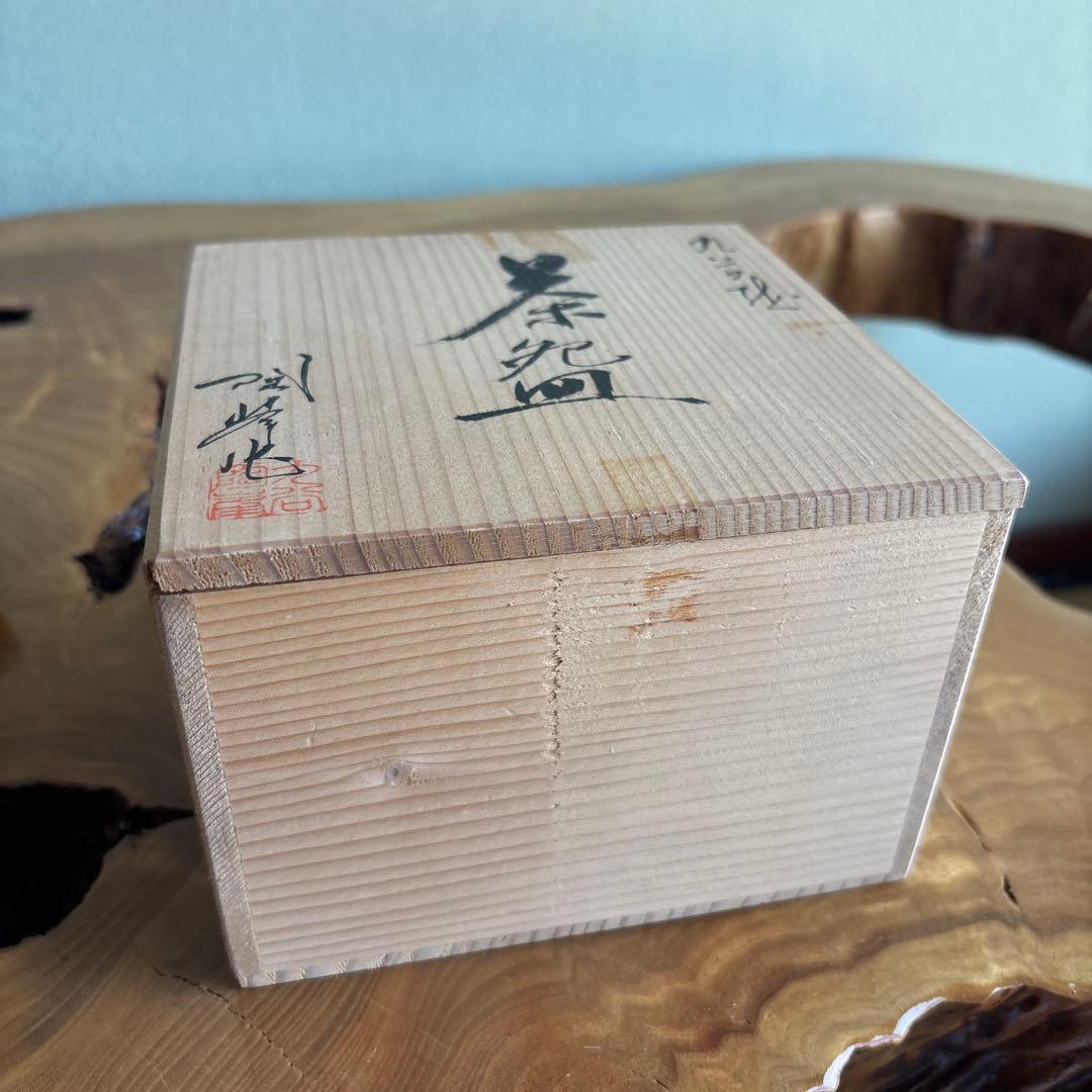
• Box: Tomobako — original signed wooden box included
• Condition: Excellent
🔹 [ CULTURAL & ARTISTIC INSIGHT ]
Kutani ware has long carried a defining tension between restraint and declaration. In Tohou's hands, that tension resolves toward the geometric. The entire outer body is governed by a repeating triangular grid — rinko-mon, the scale pattern — worked in alternating fields of gilded ground, deep cobalt, and emergent green. Gold does not accent here; it anchors.
The fine crackle running through the glaze is not damage. It is time speaking into the surface — a fine network of lines that gives the eye somewhere to rest between the assertive geometric passages.
Inside the bowl, the glazing grows quieter. The interior holds the tea, and the outer world holds the pattern. That contrast is intentional. It is where the design breathes.
Poetic Line: "The triangles do not repeat — they accumulate, like a field of decisions that have already been made."
🔹 [ DEEP-DIVE COMMENTARY ]
Kinrande (金欄手) is among the most technically demanding registers in Japanese overglaze ceramics. Derived from Chinese brocade-ware of the Ming dynasty and absorbed into Kutani's visual language during the Edo period, it calls for gold-leaf or gold-dust application over a fired enamel ground — each layer demanding precision in temperature, adhesion, and sequence.
The rinko-mon (麟甲文) — literally "scale crest pattern," named for the geometric scaling of mythological creatures — predates porcelain itself in Japanese decorative arts. As a motif it carries cultural weight: protection, continuity, formal presence. Applied here in triangle form, it shifts from the curvilinear softness of traditional scales into something more angular and confrontational. This is a deliberate authorial choice, not a standard reproduction.
Tohou works within the Kutani tradition but the design sensibility here is contemporary: the triangle-grid has the density and coherence of a pattern that could stand alongside mid-century geometric abstraction. Collectors who respond to the intersection of craft heritage and visual modernism will recognize the authorship immediately.
The tomobako (共箱) — the signed wooden box made by the artist — is not merely packaging. It is part of the object's provenance, confirming the work as a personal statement from a specific hand. In the secondary market, tomobako preserves context that otherwise dissolves.
For students of Japanese ceramics, this piece illustrates how Kutani's tradition of layered overglaze brilliance can serve as a vehicle for entirely contemporary visual propositions.
🔹 [ JAPANESE DESCRIPTION / 日本語解説 ]
【基本情報】
• 作家: 陶峰
• 技法: 金泥地に藍・緑の三角文(麟甲文)を全面施した金欄手上絵、貫入釉
• 時代: 2000年代
• 産地: 九谷焼(石川県)
• 寸法: 直径約12.5cm / 高さ約7.5cm
• 箱: 共箱(作家署名入り)
• 状態: 良好
【文化的・美術的解説】
九谷焼はつねに、抑制と宣言のあいだで揺れてきた。陶峰の手において、その緊張は幾何学へと収束する。器の外面全体を支配するのは、三角形の繰り返し格子——麟甲文だ。金泥を地に、深い藍と萌黄が交互に差し込まれ、金は点景ではなく、構造そのものとなっている。
釉薬に走る貫入は傷ではない。時間が表面に語りかける言葉であり、力強い幾何学の間に、目が静かに落ち着く場所をつくっている。
茶碗の内側は、うって変わって穏やかだ。外は模様を纏い、内は茶を抱く。その対比は必然であり、この作品の呼吸する場所でもある。
詩的な一文: 「三角は繰り返さない——それはすでに下された決断の積み重なりのように、積層していく。」
【深層解説】
金欄手は、日本の上絵磁器の中でも最も技術的な難度が高い表現のひとつである。明代中国の錦手磁器を源流とし、江戸期の九谷焼にとりこまれたこの様式は、焼成済みの上絵の地に金泥・金箔を施すもので、温度・接着・重ね順のどれひとつも妥協が許されない。
麟甲文——神獣の鱗を模した幾何学的な文様——は磁器以前から日本の装飾芸術に根ざしており、連続、守護、格式という文化的重みを宿している。これを三角形に解釈したことで、伝統的な鱗の曲線的なやわらかさから、より角張り、凛とした造形へと転換している。定番の再現ではなく、作家個人の意思表示だ。
陶峰は九谷の伝統の内側に立ちながら、デザインの感性は明らかに現代的だ。この三角格子は、中世紀の幾何学的抽象絵画と並べても揺るがない密度と統一感を持っている。陶芸の伝統と現代的な視覚言語の交差に惹かれるコレクターなら、その署名性を即座に感じ取るだろう。
共箱——作家が自ら制作し署名した木箱——は単なる梱包ではない。この作品の来歴の一部であり、特定の手から生まれた個人的な表明であることを証言する。流通市場において、共箱は文脈を保存する器だ。
九谷焼を学ぶ者にとって、この作品は重層的な上絵の伝統が、まったく新しい視覚的提案の媒体になりうることを示す一例となっている。
🔹 [ SHIPPING & PACKAGING ]
• Dispatch: Within 1-6 business days
• Carrier: Japan Post EMS / UPS (with tracking)
• Packaging: Carefully wrapped with protective materials
🔹 [ BASIC DETAILS ]
• Artist: Tohou (陶峰) — Kutani potter
• Technique: Kinrande overglaze enamel with gold-leaf (金泥) ground; geometric rinko-mon (麟甲文 / scale-pattern) in deep cobalt and emerald green triangles; fine crackle (貫入) glaze
• Era: 2000 – 2006
• Origin: Kutani ware, Ishikawa Prefecture, Japan
• Dimensions: Diameter approx. 12.5 cm / Height approx. 7.5 cm
• Box: Tomobako — original signed wooden box included
• Condition: Excellent
🔹 [ CULTURAL & ARTISTIC INSIGHT ]
Kutani ware has long carried a defining tension between restraint and declaration. In Tohou's hands, that tension resolves toward the geometric. The entire outer body is governed by a repeating triangular grid — rinko-mon, the scale pattern — worked in alternating fields of gilded ground, deep cobalt, and emergent green. Gold does not accent here; it anchors.
The fine crackle running through the glaze is not damage. It is time speaking into the surface — a fine network of lines that gives the eye somewhere to rest between the assertive geometric passages.
Inside the bowl, the glazing grows quieter. The interior holds the tea, and the outer world holds the pattern. That contrast is intentional. It is where the design breathes.
Poetic Line: "The triangles do not repeat — they accumulate, like a field of decisions that have already been made."
🔹 [ DEEP-DIVE COMMENTARY ]
Kinrande (金欄手) is among the most technically demanding registers in Japanese overglaze ceramics. Derived from Chinese brocade-ware of the Ming dynasty and absorbed into Kutani's visual language during the Edo period, it calls for gold-leaf or gold-dust application over a fired enamel ground — each layer demanding precision in temperature, adhesion, and sequence.
The rinko-mon (麟甲文) — literally "scale crest pattern," named for the geometric scaling of mythological creatures — predates porcelain itself in Japanese decorative arts. As a motif it carries cultural weight: protection, continuity, formal presence. Applied here in triangle form, it shifts from the curvilinear softness of traditional scales into something more angular and confrontational. This is a deliberate authorial choice, not a standard reproduction.
Tohou works within the Kutani tradition but the design sensibility here is contemporary: the triangle-grid has the density and coherence of a pattern that could stand alongside mid-century geometric abstraction. Collectors who respond to the intersection of craft heritage and visual modernism will recognize the authorship immediately.
The tomobako (共箱) — the signed wooden box made by the artist — is not merely packaging. It is part of the object's provenance, confirming the work as a personal statement from a specific hand. In the secondary market, tomobako preserves context that otherwise dissolves.
For students of Japanese ceramics, this piece illustrates how Kutani's tradition of layered overglaze brilliance can serve as a vehicle for entirely contemporary visual propositions.
🔹 [ JAPANESE DESCRIPTION / 日本語解説 ]
【基本情報】
• 作家: 陶峰
• 技法: 金泥地に藍・緑の三角文(麟甲文)を全面施した金欄手上絵、貫入釉
• 時代: 2000年代
• 産地: 九谷焼(石川県)
• 寸法: 直径約12.5cm / 高さ約7.5cm
• 箱: 共箱(作家署名入り)
• 状態: 良好
【文化的・美術的解説】
九谷焼はつねに、抑制と宣言のあいだで揺れてきた。陶峰の手において、その緊張は幾何学へと収束する。器の外面全体を支配するのは、三角形の繰り返し格子——麟甲文だ。金泥を地に、深い藍と萌黄が交互に差し込まれ、金は点景ではなく、構造そのものとなっている。
釉薬に走る貫入は傷ではない。時間が表面に語りかける言葉であり、力強い幾何学の間に、目が静かに落ち着く場所をつくっている。
茶碗の内側は、うって変わって穏やかだ。外は模様を纏い、内は茶を抱く。その対比は必然であり、この作品の呼吸する場所でもある。
詩的な一文: 「三角は繰り返さない——それはすでに下された決断の積み重なりのように、積層していく。」
【深層解説】
金欄手は、日本の上絵磁器の中でも最も技術的な難度が高い表現のひとつである。明代中国の錦手磁器を源流とし、江戸期の九谷焼にとりこまれたこの様式は、焼成済みの上絵の地に金泥・金箔を施すもので、温度・接着・重ね順のどれひとつも妥協が許されない。
麟甲文——神獣の鱗を模した幾何学的な文様——は磁器以前から日本の装飾芸術に根ざしており、連続、守護、格式という文化的重みを宿している。これを三角形に解釈したことで、伝統的な鱗の曲線的なやわらかさから、より角張り、凛とした造形へと転換している。定番の再現ではなく、作家個人の意思表示だ。
陶峰は九谷の伝統の内側に立ちながら、デザインの感性は明らかに現代的だ。この三角格子は、中世紀の幾何学的抽象絵画と並べても揺るがない密度と統一感を持っている。陶芸の伝統と現代的な視覚言語の交差に惹かれるコレクターなら、その署名性を即座に感じ取るだろう。
共箱——作家が自ら制作し署名した木箱——は単なる梱包ではない。この作品の来歴の一部であり、特定の手から生まれた個人的な表明であることを証言する。流通市場において、共箱は文脈を保存する器だ。
九谷焼を学ぶ者にとって、この作品は重層的な上絵の伝統が、まったく新しい視覚的提案の媒体になりうることを示す一例となっている。
🔹 [ SHIPPING & PACKAGING ]
• Dispatch: Within 1-6 business days
• Carrier: Japan Post EMS / UPS (with tracking)
• Packaging: Carefully wrapped with protective materials
Quantity
Couldn't load pickup availability
Low stock: 1 left
View full details