1
/
of
16
Kinrande Gold-Brocade Sake Cup by Ono Hakuko — Arita Porcelain with Signed Paulownia Box
Kinrande Gold-Brocade Sake Cup by Ono Hakuko — Arita Porcelain with Signed Paulownia Box
Regular price
Dhs. 1,384.00 AED
Regular price
Sale price
Dhs. 1,384.00 AED
Taxes included.
Shipping calculated at checkout.
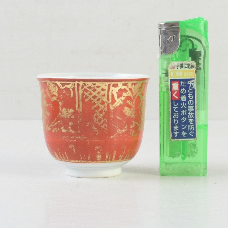
A guinomi by Ono Hakuko (1915-1996), the Arita potter who carried kinrande — the iron-red and gold-brocade overglaze idiom of late Imari — into the second half of the twentieth century. The body is high-fired Arita porcelain, glazed white inside and along the foot, then dressed on the exterior in a deep iron-red ground. Over that ground, gold has been laid in dense karakusa scrollwork, lotus-petal panels, lattice diapers and stylised hosoge-mon medallions, drawn line by line in fine brushwork. The shape is upright and slightly tapering, with a small turned foot and a quiet, lightly bluish white interior. The piece arrives in its original signed paulownia tomobako, marked with the artist's seal in red — a small object that carries the weight of a long lineage.
🔹 [ BASIC DETAILS ]
• Artist: Ono Hakuko (小野珀子, 1915-1996)
• Technique: Kinrande — iron-red ground with gold-leaf overglaze (aka-ji kinrande)
• Form: Guinomi / sake cup (also serviceable as a small tea cup)
• Origin: Arita, Saga Prefecture, Japan
• Era: Showa to early Heisei (circa 1970s-1980s)
• Dimensions: H approx. 5 cm × W approx. 5.6 cm
• Weight: approx. 51 g
• Condition: Used vintage. No chips, no cracks, no restoration observed. The gold shows the soft, partial wear that comes from honest handling — a quality kinrande collectors look for. Interior glaze clean with light age-tone. Paulownia box shows natural patina and inked inscription with the artist's seal.
• Accessories: Original signed paulownia tomobako (kiri box), shifuku cloth
• Workshop reference: A107 (artist's inventory mark)
🔹 [ CULTURAL & ARTISTIC INSIGHT ]
Kinrande — literally "gold brocade" — is the name given to the overglaze technique in which gold leaf or gold pigment is fired onto a finished porcelain surface, almost always over a red, blue or black ground. In Japan, the idiom enters the historical record through late Ming Chinese porcelains carried into the tea world during the Momoyama period, and is then absorbed and re-imagined at Arita through the seventeenth and eighteenth centuries as part of the Ko-Imari and Nabeshima vocabularies. Arita kinrande became one of the most legible signatures of Japanese porcelain abroad: the red-and-gold cup, the gilded medallion, the densely worked surface that Europe knew as "Old Imari."
Ono Hakuko worked inside that long lineage rather than against it. Based in Arita, she devoted her career to refining kinrande as a contemporary studio practice — keeping the historic palette of bengara red and gold, but tightening the drawing, simplifying the compositions, and allowing the white porcelain to breathe at the rim and foot. Her work is held in public and private collections of modern Japanese ceramics, and she is consistently named among the figures who carried gold-brocade Arita through the post-war decades into the present. The seal A107, inked on the tomobako, is the kind of inventory mark a working studio uses to track individual pieces.
In philosophical terms, kinrande is a meditation on contrast. Red is the colour of celebration, of vermillion shrine gates, of the lacquered interior of a tea bowl. Gold is the colour of stillness — Buddhist statuary, folded screens, the inside of a temple altar. When the two are placed against the cold whiteness of Arita porcelain and then warmed by sake or tea, the cup stops being decoration and becomes a quiet small instrument for paying attention.
🔹 [ DEEP-DIVE COMMENTARY ]
Kinrande is structurally a three-firing object, and understanding that helps explain what is in your hand. First, the porcelain body is thrown, trimmed and bisque-fired. Then a clear glaze is applied and the piece is fired in the main reduction kiln (honyaki) at roughly 1300°C — this is the firing that produces the bluish-white interior and the hard, vitrified body visible at the unglazed foot ring. Only after this is the iron-red ground (bengara) painted on, fixed in the lower-temperature enamel kiln (akae-gama) at around 800°C. Finally, gold is laid down — historically as gold leaf adhered with a lacquer-like medium, in modern practice often as gold pigment — and fired a third time at a still lower temperature so the gold fuses to the red ground without burning away. Each firing carries a real risk of loss; a finished kinrande cup has survived three separate kiln events.
Look at the red ground on this cup. It is not flat. There is a subtle modulation across the surface — a slightly more saturated zone where the brush rested, a lighter zone where it travelled. That uneven, almost lacquer-like depth is the signature of hand-applied bengara, and it is one of the easiest ways to distinguish a workshop kinrande from later screen-printed or decal imitations: industrial red is dead flat, hand-painted red breathes.
The gold-work is the second register to read. The drawing is dense — karakusa vines coiling around lotus medallions, lattice diapers framing the central motif, lobed panels at the upper register — but it is not crowded. Each line was laid in by hand with a fine brush, and the gold shows the soft partial wear that traditional Japanese collectors actively prize: the high points of the cup, where a thumb naturally rests and where the lip meets the mouth, have lost a little gold, while the protected hollows remain bright. This kind of differential wear cannot be faked at the factory level. It is the reason a used kinrande cup is often valued above an unused one — it has lived through the ritual it was made for.
The third register is the white. Open the cup and look down: the interior is left almost entirely undecorated, glazed in a quiet bluish-white with a single faint band near the rim. This restraint is deliberate. In tea and sake practice the interior is where the liquid lives and where the eye rests once the cup is raised; a busy interior would interrupt that moment. The contrast between the loud exterior and the silent interior is the central design decision of the piece.
Compared with contemporary kinrande — bright, evenly gilded, often produced with gold lustre rather than gold leaf — Ono Hakuko's work feels older. The red is closer to lacquer than to enamel, the gold is laid in drawn lines rather than printed fields, and the wear is honest. The original signed paulownia box, with brushed title and red seal on the lid, locates the cup inside a single artist's hand rather than a generic Arita workshop output. For collectors of post-war Japanese porcelain, that combination — recognised artist, intact tomobako, honest patina — is the configuration that holds cultural weight over time.
🔹 [ 日本語解説 ]
小野珀子(1915-1996)による有田の金襴手ぐい呑です。赤地に金彩で唐草・蓮弁・連珠文を緻密に描き、見込みは青白磁の静けさを残しています。共箱(桐箱)に題字と朱印あり、A107の管理番号付き。三度の焼成を経た本格的な赤絵金襴の上手作で、口縁と高台脇に見られる金の自然な擦れは、長年の使用が育てた景色です。欠け・割れ・直しは確認されません。江戸古伊万里以来の金襴手の系譜を、昭和の有田で受け継いだ作家の一碗。酒器としても小服茶碗としても使えます。
🔹 [ SHIPPING & PACKAGING ]
• Dispatch: Within 1-6 business days
• Carrier: Japan Post EMS / UPS (with tracking)
• Packaging: Carefully wrapped with protective materials
Quantity
Couldn't load pickup availability
Low stock: 1 left
View full details